
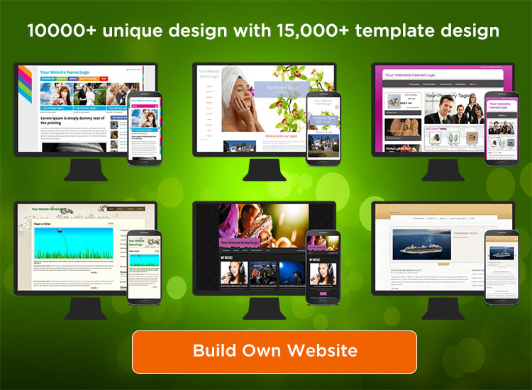
SiteGalore is now loaded with 10000+ unique designs with 15,000+ template design to choose. All our new site builder website design templates are fully responsive and built in the way to detect user’s device, size and orientation and change it layout. Our website templates are functionally superior with flexible option to customize the design as well.
Responsive and Mobile-first: Mobile first and responsive design is recommended by all search engines in world. Responsive web pages which means templates are optimized well to fully suite your mobile, desktop and tablet screen size. So no matter now how your visitors viewing your website. Yes, it automatically adapt to your screen size and orientation.
Also mobile first indexing is trending across all the search engines, when your website optimized for mobile screen resolution, then it has high possibility of ranking in top position. Website build using SiteGalore website builder tool looks cool on all devices and browsers automatically.
Easy to Customize: Our design templates are easy to customize all visual and text elements. Upload your own logo, header image, image gallery, change title, sub title and navigation links. Our site builder application is perfectly suitable web designers. They can provide comprehensive white label website builder solution to their client using SiteGalore.
Here is our new sample design template gallery,


